Case Study: Barb Allen, Reno Realtor
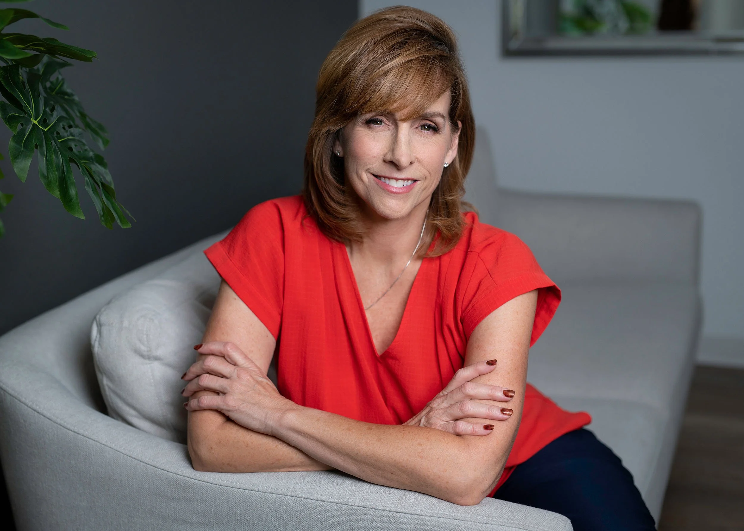
Barb is a Solid Source realtor in Reno, Nevada. She’s a lifelong Reno resident who has worked for more than 20 years in property management and real estate. She knows the area well and understands the needs of her clients, especially those making the leap from renter to homeowner.
Barb is committed to helping buyers and sellers make smart choices that protect them from the ups and downs of an unpredictable market. Her professional yet friendly approach makes her fun to spend time with and an effective negotiator.
Visit her website and say hello ➤ barballenrealtor.com
Goals for Barb’s Project
Barb has been a licensed realtor in Nevada for over five years but didn’t have cohesive branding assets for effective marketing. She had been using casual social media posts, canvassing neighborhoods, and sending mailers with minimal returns.
She was ready for:
Strong personal branding to coordinate with her brokerage’s existing logo.
A beautiful website built to consolidate her knowledge and experience.
A blog to share her insights and bolster her business in a Google search.
A way to attract clients who are a good fit for her expertise and professional style.
The Before
Before we worked together, Barb relied on Realtor.com and the agent directory provided through her broker’s website.
“I was stagnating. I needed a platform that had a longer reach and design help that went beyond the stock forms off the internet. I was intimidated by how time-consuming marketing was on top of my job as a realtor. Angie took over a large section of my business, self-promotion, and made it beautiful and easy for me to manage.”
❤️ Barb Allen
Project Highlights
One month after launch Barb reports:
It's the best thing I've ever done for my business. I wish I had done it sooner.
STANDING OUT ONLINE
My brand is much more recognizable. I'm getting a lot more attention.
I feel rejuvenated
in my career.
AFFINITY FOR BLOGGING
I honestly had no idea how much I would love the website-blog.
Colors + Fonts
For the color palette, Barb loves the fall and gravitates toward jewel tones. She wanted a warm and inviting vibe for her branding and website. The deep maroon coordinates well with the red of her brokerage’s logo without being too matchy-matchy (that’s professional design term).
I created a brand kit based on this color palette and her style preferences. This gave her a sense of the visual direction of the website—these stock images and font selections guided us to the final project.
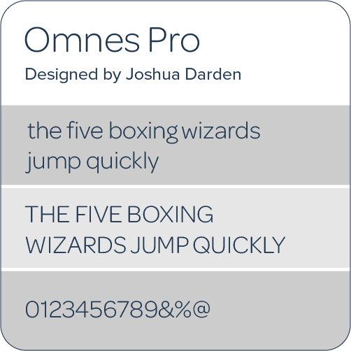
To create a professional, approachable feel on the website, I used the font Omnes Pro. I chose it for its legibility and subtly rounded edges that scale nicely for headlines.
For Barb’s logo, I used Montserrat for its selection of alternative characters, specifically the “E,” which gives a nod to Nevada and the old west.
Logo + Brandmark
Primary Logo is crisp, strong, and instantly recognizable. The Nevada shape honors Barb’s roots. Giving it a simple tagline lets viewers know exactly what Barb does and where she does it. The primary logo will be used on the website, social media, and in printed assets such as business cards and fliers for property listings.
Secondary Logo is the primary logo minus the Nevada shape. This variation is important for use in projects that don’t have room for the taller primary logo.
Brand Mark is Barb’s initials inside the Nevada shape. It is used in her website footer and as a decorative element for promotional materials and social media.
Primary Logo
Primary Logo (Negative)
Secondary Logo
Brand Mark (negative and positive)
Photography
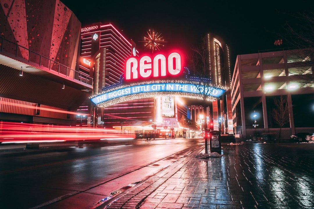
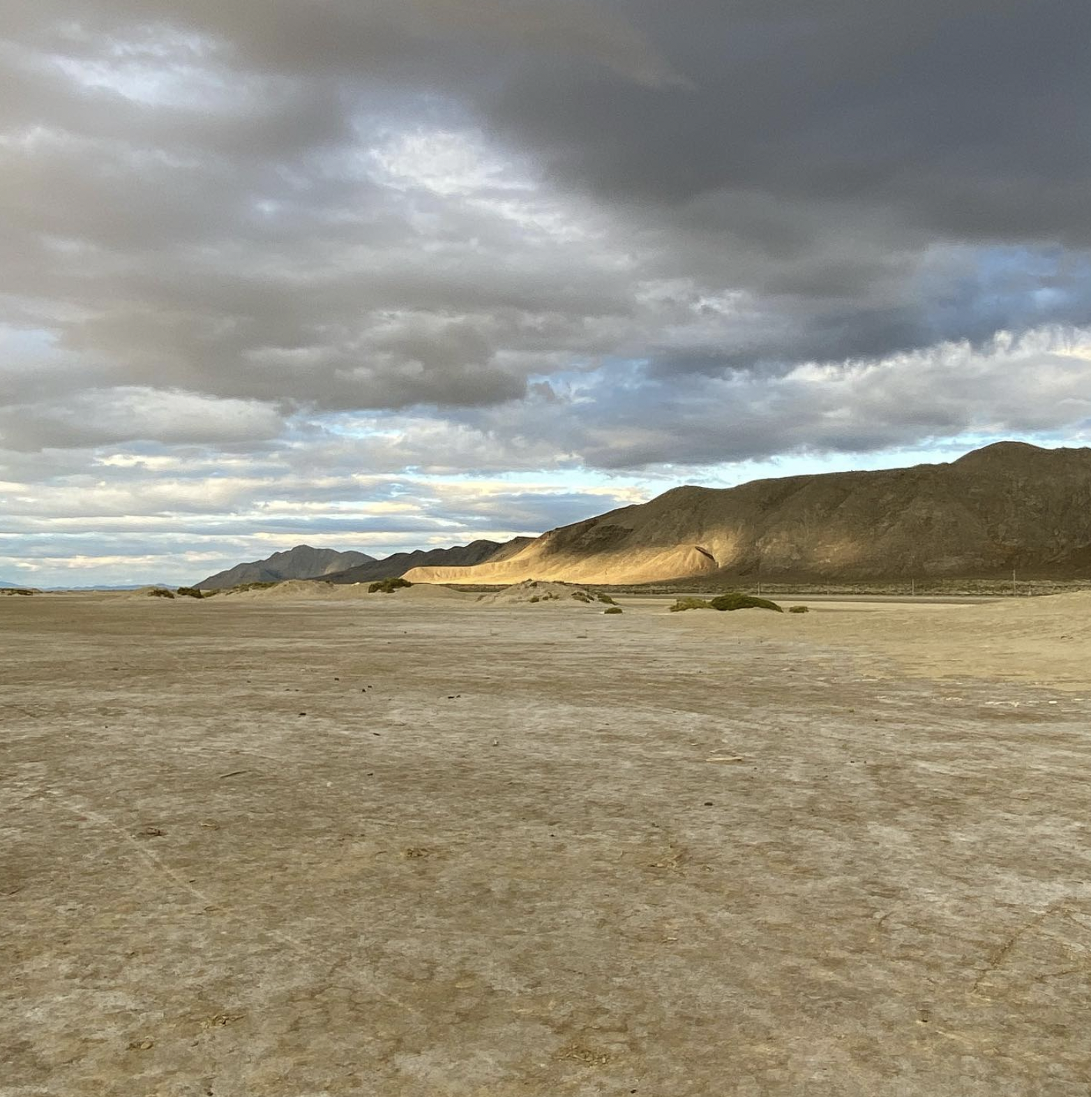
Location, location, location. The photography used on the website represents Northern Nevada and homes in the area. Most of the imagery is from Barb’s personal collection or professional photography from her pervious real estate listings. To fill out the site, I added a handful of regional stock images taken by local photographers. Her stunning headshots were taken by Reno photographer Amber Ezell.
For her blog posts and neighborhood pages she uses her own photography in combination with Unsplash stock images available directly through the Squarespace platform.
Copywriting
Barb and I collaborated on the copywriting process. We began with a brand interview discussing her services and target audience. I took copious notes on the details of her business and the unique way she speaks, including her phrasing, cadence, and style.
Next, Barb completed a detailed copywriting workbook I created for real estate agents. It was a significant undertaking she conducted over one week. By completing the packet thoroughly, Barb reflected on her business with a new perspective. The process helped her write with both her buyers and sellers in mind.
Finally, I used her work to write the copy for the website. I placed her words and phrasing strategically to create a conversational, easy-to-read logical flow optimized for search engines and voice search - Yo, Siri!
Additional Marketing Assets
In addition to branding and website design, Barb needed coordinating marketing assets to use in print and social media. I designed the following elements using her new logo and branding.
Lead Magnet - a downloadable PDF booklet
Squarespace Email Campaigns - imported her existing mailing list and designed two branded templates for a monthly newsletter and event invitations
Business Card
Social Media Banners - LinkedIn, Facebook, and Alignable
Canva templates - editable thumbnails for blog and neighborhood posts
The Website
I combined the colors, logos, fonts, imagery, and text to build a website that reflected Barb’s professional personality and made it easy for visitors to get to know and reach her.
The goal of the site is to help potential home buyers and sellers feel comfortable starting a conversation with Barb. I prominently displayed her phone and email throughout the site. I also added a scheduling option for readers who prefer to make a formal appointment and a detailed contact form for those who like to communicate online.
The completed website consisted of six main elements:
Core pages: Home, About, Contact, Privacy Policy
Sales Pages: A Buyers Page and Sellers Page
A blog: Insights about the Reno real estate market, area hotspots, and home maintenance tips
Neighborhoods: A secondary blog to highlight different Northern Nevada neighborhoods
Scheduling Page: Calendly scheduler to book a phone consultation
Lead Magnet Download Page
Mobile Responsive Design - Most of Barb’s visitors view her website on a mobile device. Mobile design was my top priority.
Home Page
About Page
Results
After launching her website and creating brand continuity across her social media accounts, Barb felt rejuvenated about her career and received positive feedback from clients and peers. It’s only been one month since her launch, and in that time, she’s already been contacted about collaborative blogging.
Here’s what she said about our work together:
“What I appreciate most about working with Angie was the high quality of work and her willingness to help me learn. I had no idea what I was missing and how a beautiful website could change the game for my business. I was lagging in my own self-promotion. She helped me take all my knowledge and experience and consolidate it into a beautiful website.”
❤️ Barb Allen
You deserve a modern website are you’re excited about.
If you’re a real estate or home design professional, I can help you increase your online visibility, even in today’s crowded market. Let's build a website that gets you seen by your ideal client, gives you the credibility you’ve earned, and supports the clients you’ve worked with for years.

