Case Study: LCDmodern • Brick+Mortar Shop
Linda C. Demers (LCD) is the founder, owner and manager of LCDmodern, a concept furniture, decor, and gift store in Reno, Nevada. Her products are thoughtfully designed, adaptable, and functional. Her furniture and accessory lines are chosen for quality, sustainability, and quick-shipping.
Linda began her business in 2005, under the name à la mode, designing and creating jewelry, handbags, and home decor. She sold online and in stores throughout the country. In 2018, she rebranded to LCDmodern with the dream of opening a store. In August 2022, Linda opened LCDmodern in Reno’s West Moana District.
Visit her website and say hello ➤ lcdmodern.com
Goals for Linda’s Project
Linda is naturally innovative and tech-savvy, but her priority was launching her brick+mortar store. She had a vision for branding and web design but didn’t have time to get bogged down in details. That’s where I stepped in to help.
For a smooth launch, she needed:
Branding for her storefront, website, and promotional materials.
A website built to be an informational hub.
An E-commerce store for furniture, decor, and gift items.
Strong SEO to attract customers and build connections in the Reno area.
“I was just starting my brick and mortar business and there weren't enough hours in the day to look at or worry about my website. It was great to be able to launch a new website and store at the same time. Websites are extremely time consuming and there are too many things that can go wrong.”
❤️ Linda Demers
The Before
Linda had an Squarespace 7.0 website she built using the minimalist and timeless Brine template. With big changes in her business, she needed robust e-commerce capability, branding, and an update to the Squarespace 7.1 platform.
Logo + Brandmark
Linda and I started our journey when she was hunting for a prime storefront location and daydreaming about the vibe her shop would take on. We began, not with a website, but with a logo. She had a name, a font, and an inspiration: The iconic Eames Dining Chair.
I created a brandmark by drawing a simplified version of the chair. The symbol was the starting point for all aspects of LCDmodern’s branding and website.
Primary Logo - a vertical logo with name, brandmark, and tagline. A tagline lets passers-by know exactly what they will find when they visit the store. This logo incorporates all the elements to be used in future marketing materials such as bags and promotional assets.
Secondary Logo - a horizontal logo for use in website headers and stationery. This variation is important for use in projects that don’t have room for the taller primary logo. I included a version without the tagline for a streamlined look.
Brandmark - the symmetrical and bold symbol of LCDmodern. It works as a decorative element for marketing and social media and to make a big impression. A 5 foot cling of the brandmark welcomes customers from the front window of Linda’s store.
Colors + Fonts
Mid Century Modern trends influence Linda’s style. While her store nods to MCM, it has a modern, universal appeal for all design aesthetics. Traditional MCM colors and tones from her product lines inspired her color palette.
I created a brand kit based on this color palette, products for the store, and her style preferences. It gave her a sense of the visual direction of the website—these images came directly from her product lines and personal photography.
Linda had been using Arial MT Std Light for several years and chose to keep it for her branding and website. It isn’t a native Squarespace font, so I customized her website code to incorporate it as her header and paragraph font.
Project Highlights
Reflections from Linda:
Knowing you were paying attention to the details for me was amazing
I appreciated how you listened and responded promptly
Knowing my website is professional looking and organized gives me tremendous relief
I got exactly what I was looking for and a great foundation for future endeavors
The Website
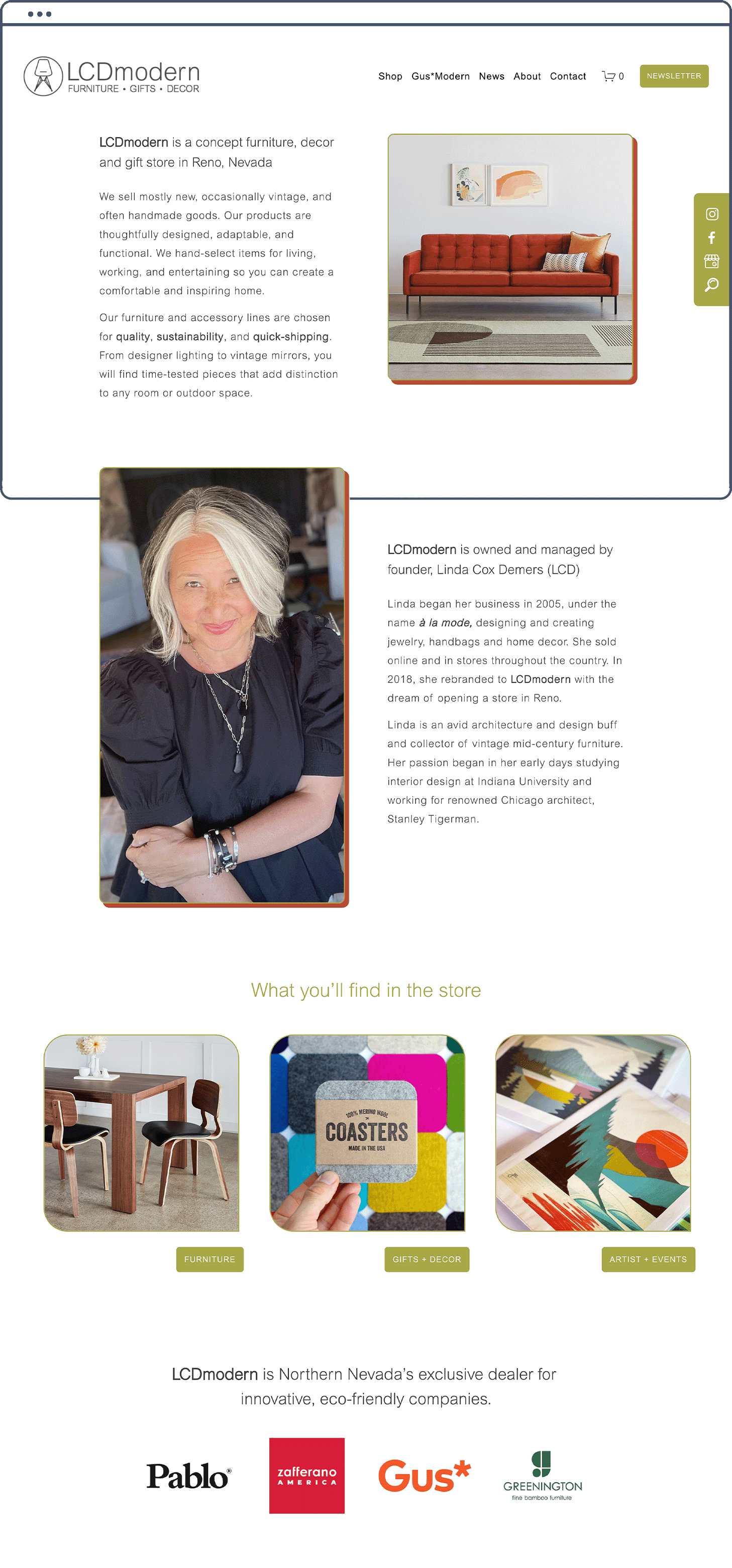
I created a clear website structure for Linda’s customers to easily navigate the site from mobile or desktop. More than half of Linda’s visitors view her site on mobile devices thanks to her strong and engaging Instagram presence.
Visitors can easily find her store hours, contact her directly, and order products from the website. I applied Squarespace SEO practices and voice search optimization so customers can find her through an internet search or an iOS or Android voice search.
The website consisted of three main elements:
Core Pages:
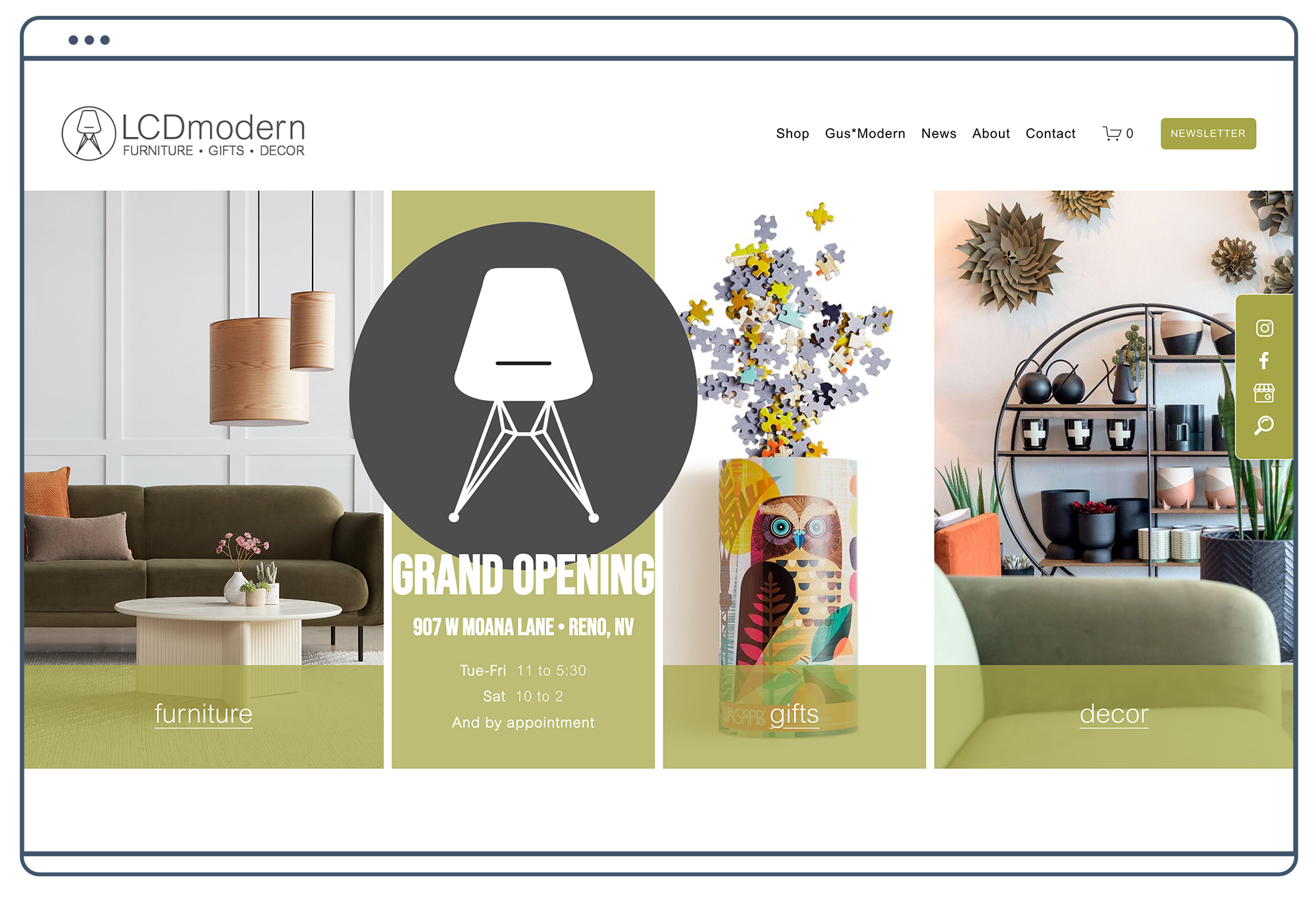
Home - An overview of Linda’s business, style, and products. Quick links to specific product categories such as Gifts, Furniture, and Decor as well as recent blog posts with her latest sales and events.
About - An introduction to Linda and her history, influences and inspirations.
Contact - Store hours, Google map, contact form, and social media links.
FAQ - A place for quick answers to common questions. This section helps boost LCDmodern’s voice search optimization. Siri loves FAQ sections.
Newsletter Signup - An easy way for customers to stay up to date with the latest LCDmodern news, events, sales, and product launches.
E-Commerce:
Main Online Shop - Gift and decor items sold online and shipped nationwide from in-store inventory.
Secondary Online Shop - A shop exclusively for Gus*Modern furniture, lighting, and accessories. Orders can be drop-shipped nationwide. Gus floor models available in-store can be purchased online for local pick-up or delivery.
A Blog:
An Informational Hub - Individual posts chronologically showcase the latest events, products, and sales.
Additional Marketing Assets
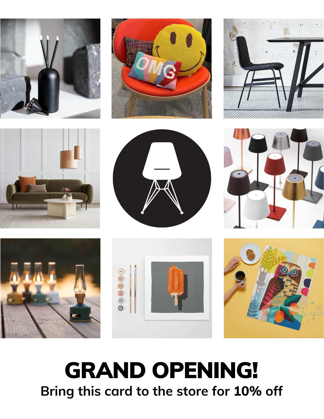
In addition to branding and website design, Linda needed coordinating marketing assets to use in print and social media. I designed the following elements using her new logo and branding.
Storefront and Roadside Sign mockup
Business Card design and print files
Postcard in an editable Canva format
Results
We launched the website in June, prior to LCDmodern’s opening. The site gave visitors a taste of what was to come and an opportunity to sign up for her newsletter. Since the August Grand Opening, she has used the website for out-of-town sales, keeping locals apprised of events and workshops, and updates on the latest products arriving in the store.
As LCDmodern evolves, so do the needs of the website. In the New Year, we plan to incorporate a third-party shipping client to streamline online sales, shipping, and in-store inventory tracking. While it won’t change the look of the website, it will increase efficiency for Linda as her business grows.
Here’s what she said about our work together:
“I appreciated the teamwork we shared in bouncing ideas off each other. It's easy to get bogged down in the details, but it was helpful to have your ear and know you'd get back to me with a solution or suggestion. That interaction put my mind at ease.”
❤️ Linda Demers
You deserve a modern website are you’re excited about.
If you’re a real estate or home design professional, I can help you increase your online visibility, even in today’s crowded market. Let's build a website that gets you seen by your ideal client, gives you the credibility you’ve earned, and supports the clients you’ve worked with for years.


